I started writing this post over three weeks ago, when it seemed important. It now seems frivolous. This may make it even more important than it was before, depending on who you are and what you are looking for right now. Either way, I hope you enjoy it.
Last summer I attended a course at The Henley on Thames School of Art called “Introduction to creative paper cutting”. It took me a while to finish my creations and sort through all my photos but, having finally managed that, I thought I would share them with you.
I attended the course, not because I wanted to learn how to cut paper, but because I like going on courses. I hadn’t been on one for a while and thought I would treat myself. Of all the topics, I thought paper cutting might be quite suitable. If nothing else, the end products would be flat and easy to store. Crucial when you are the type of person that never throws anything away.
The course was run by Christine Green – a superbly talented designer, maker and wearer of kaftans. She guided us through the basics of scalpel management then asked us to design a logo. The starting point she gave us was something quite specific. I’ll show you what I ended up with then I’ll tell you how I got there.
Here is my first proper papercut:
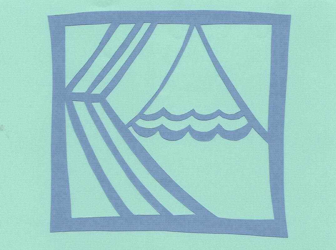
I like to think of it as a curtain being drawn back to reveal an alpine landscape. Do you see it?
Really it’s just two letters.
Really it’s just two letters.
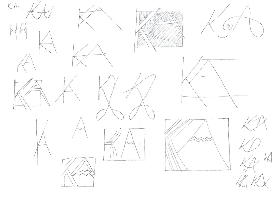
I took my initials on a meandering journey. Sometimes angular, sometimes wiggly. My first draft looked like this:

The hardest part was incorporating all the elements without leaving any sections adrift. You have to think like you are designing a stained glass window. Each segment must be encased by leads. With this, I did not succeed. Had my design been realised in glass, the floor would have been littered with lethal shards.
I took my drawing to Christine, thinking my idea was unworkable. Employing her experience and logic, she showed me a solution:
I took my drawing to Christine, thinking my idea was unworkable. Employing her experience and logic, she showed me a solution:
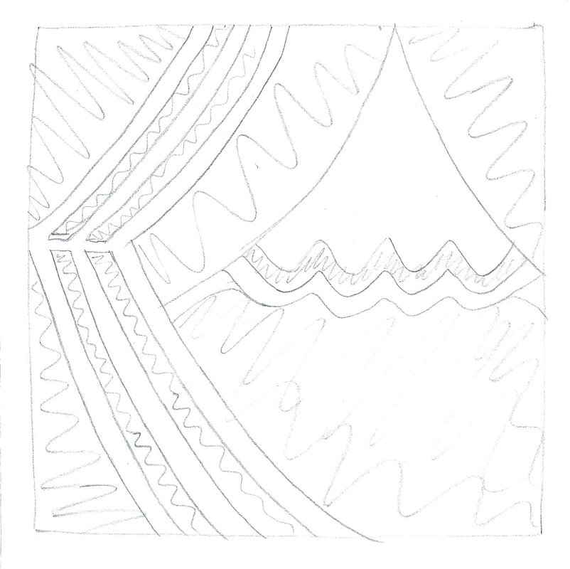
This was the blueprint for the papercut you saw earlier.
I think most people threw away their offcuts. Characteristically, I kept mine. I assembled it to form a “negative”.
I think most people threw away their offcuts. Characteristically, I kept mine. I assembled it to form a “negative”.
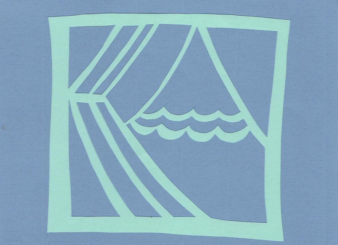
I think of it as a piece in its own right.
Our next task was to use all the skills we had gained and design something bigger and more complex. I’m not sure I really fulfilled this brief. My “showstopper” was only marginally bigger than my logo. It was more intricate (after one or two late-stage additions), so maybe I came good on the complexity stakes, but size-wise it was lacking.
As with the final round of Bake Off, this was something we could prepare in advance. We had been told to bring an idea. “Paper” made me think of “paper wedding anniversary” which my brother and his wife would be celebrating in the autumn. “My brother and his wife” made me think of “bats” because bat-spotting is something they like to do together. Most people came up with inspirational quotes involving love and cats (sometimes both) but once those pipistrelles had entered my brain space it was hard to shake them loose. I had to accept they were there to stay.
This image shows the progression of my design:
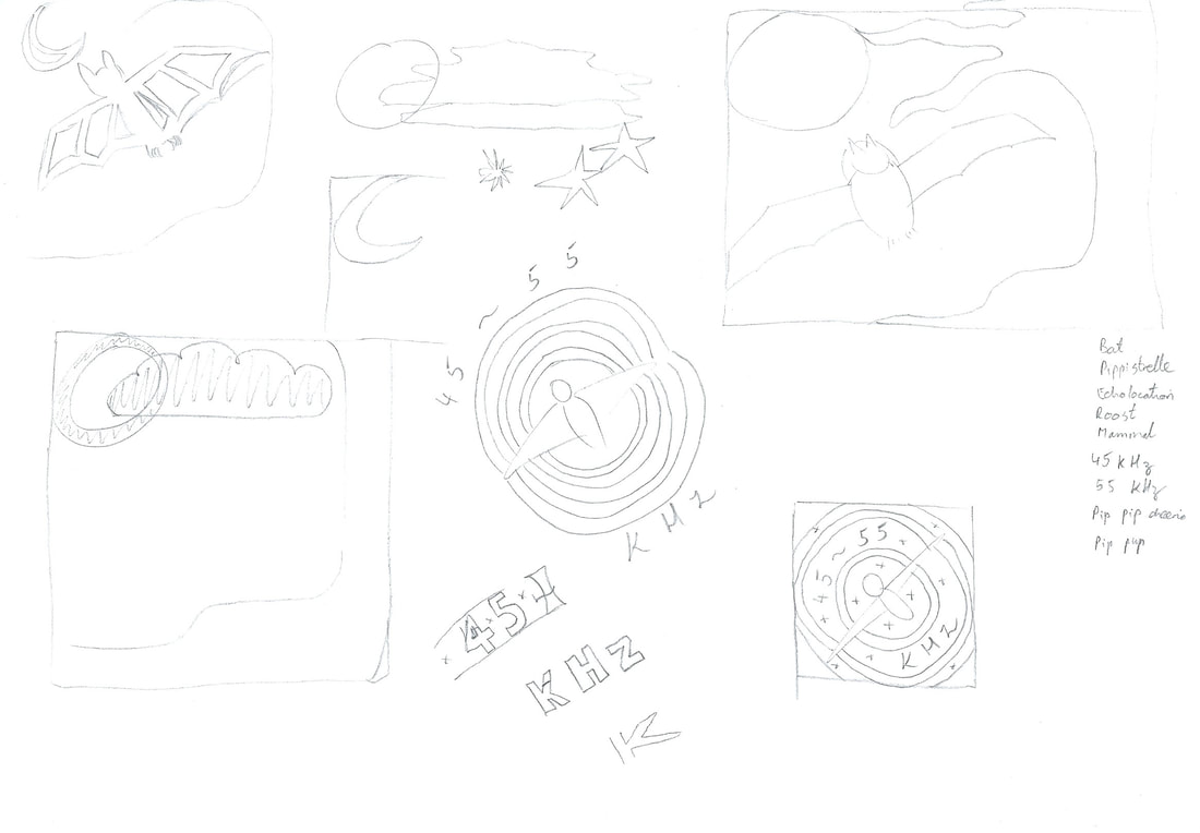
Initially I played around with a bat/tree/moon combo. A kind of paint-by-numbers nightscape. I struggled to make all the sections link up and adding a cloud and some stars didn’t help. It looked like something I would have done in junior school.
At some point I decided to go all out and place my bat directly in front of a full moon, trick or treating style. One full moon became several full moons which became concentric sound waves. Topically relevant and a much easier foundation for a viable papercut. No bat bits falling out of the sky here.
I surprised myself by drawing the bat freehand. I had a look on Google Images for guidance but the ultimate pencil wrangling was all mine.
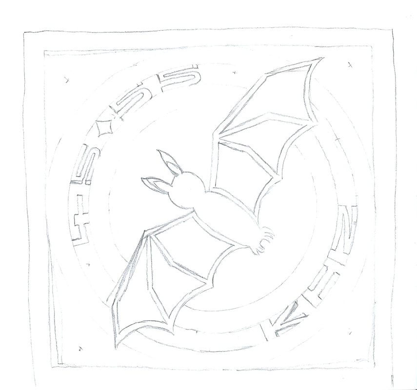
I wasn’t going to add letters but the rest of the class was showing me up by doing whole phrases so I thought I had better throw some in. I toyed with the idea of some bat puns but didn’t come up with anything. (Nothing good, anyway.) Eventually I settled on “45-55 kHz” because it represents the range of frequencies used to detect certain bat signals (something I learned on a night walk at my local nature reserve) and I couldn’t think of anything else. It’s pretty niche, I’ll give you that. My cat-loving peers smiled politely but you could tell they were not fully on board with my tribute to bat conservation.
This is my final sketch:
At some point I decided to go all out and place my bat directly in front of a full moon, trick or treating style. One full moon became several full moons which became concentric sound waves. Topically relevant and a much easier foundation for a viable papercut. No bat bits falling out of the sky here.
I surprised myself by drawing the bat freehand. I had a look on Google Images for guidance but the ultimate pencil wrangling was all mine.
I wasn’t going to add letters but the rest of the class was showing me up by doing whole phrases so I thought I had better throw some in. I toyed with the idea of some bat puns but didn’t come up with anything. (Nothing good, anyway.) Eventually I settled on “45-55 kHz” because it represents the range of frequencies used to detect certain bat signals (something I learned on a night walk at my local nature reserve) and I couldn’t think of anything else. It’s pretty niche, I’ll give you that. My cat-loving peers smiled politely but you could tell they were not fully on board with my tribute to bat conservation.
This is my final sketch:
And this is my finished Batty:
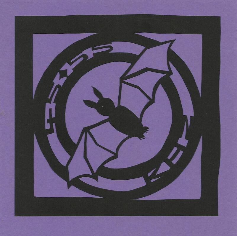
Quite striking, isn’t he?
I might have mentioned before that I’m rather slow. At one point on the course it was touch and go whether I would produce anything at all. Christine was considerably alarmed when I said I was going to incorporate the word “kilohertz” into my design. “And how are you spelling that?” she asked, letting out a sigh of relief when I explained I would be using the abbreviation.
It would have been preferable to complete my winged friend in the comfort of the studio, with all the best equipment. However, I had to concede that, if I rushed, at least one of us would be leaving with less digits than was preferable and that I should try to close the deal at my own pace once home. An ancient craft knife from my school days and a chopping board from our kitchen turned out to be fine substitutes for the professional scalpel and cutting mat I had been using all day. A couple of hours after finishing the course, Batty was born.
I was able to select a background for him before I left the studio, something that proved trickier than I had imagined. I assumed a deep blue would be the shade to go for but it just didn’t “cut it”. I hope you agree that the contrasting purple works quite well.
You may notice that the dash I promised between the “45” and “55khz” has, in fact, become a diamond. This is because, as I mentioned earlier, it is impossible to incorporate any element without anchoring it to the rest of the design. Thus my dash had to grow little protuberances top and bottom so as not to fall off the page completely.
The images you have seen so far are scans. They were made once my papercuts were stuck to their foundations using double sided tape. I like the clarity of them but I’m also quite partial to this last, slightly more rugged image.
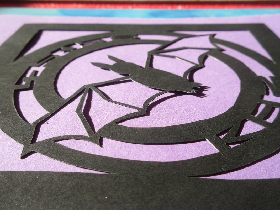
It’s a photo taken at our dining room table, in the early evening sun, on the day of the course. The cutting was finished but the bonding of bat to background was not yet complete. I think the combination of all these factors makes for a pleasing result: the knife marks on the paper; the shadows cast by his tiny little feet. It’s almost like he’s ready to fly.
 RSS Feed
